
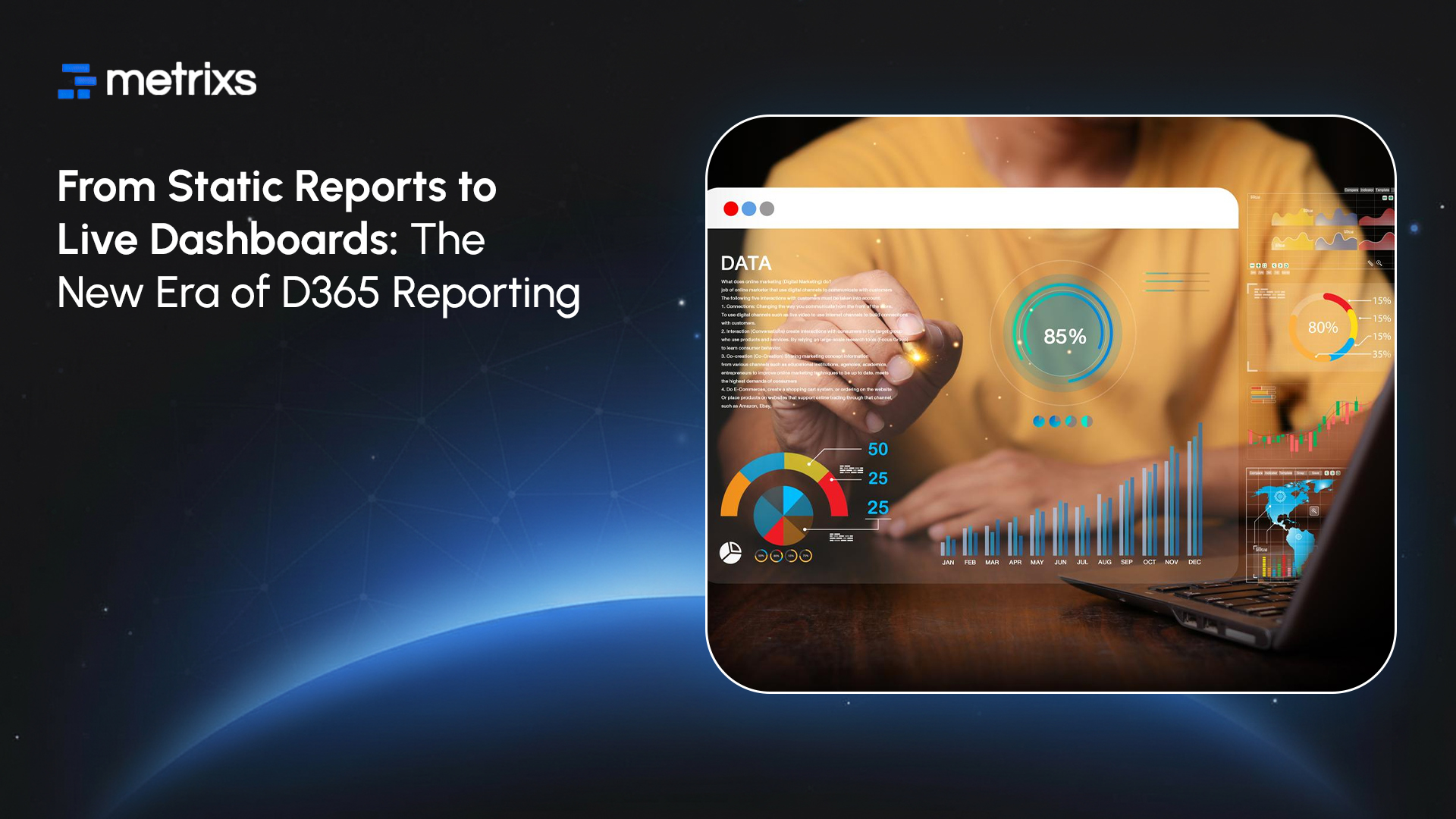
For decades, managers relied on static Excel sheets circulated monthly. These reports only told you what already happened. That method fails today because markets shift hourly. D365 dashboards replace this obsolete model with real-time Power BI reporting. You no longer need to wait for manual refreshes.
D365 dashboards solve this by connecting streams instantly. This live analytics transformation lets you spot operational shifts the moment they occur. You stop looking at history and start managing the present.
Why Static Reports No Longer Work
Relying on spreadsheets or PDFs slows down your entire team. You make choices based on information that expired weeks ago. This lag creates a disconnect between what reports say and what actually happens on the production floor or sales field. Static vs. live reporting is no longer a choice about preference. It is about survival.
1. Delayed Data = Delayed Decisions
Static reporting forces you to look backward. By the time a finance team reviews last month’s cash flow statement, spending patterns have already shifted. If a sales leader waits for a weekly pipeline PDF, they miss the moment a key deal stalls.
These delays cost you revenue. A supply chain manager using D365 dashboards sees a stock shortage immediately. A manager relying on a static export sees it three days later. That delay means missed shipments and unhappy customers. Data-driven decision-making fails when the data is stale.
2. Inflexibility That Blocks Insight
Static reports only answer questions someone asked weeks ago. Business needs change faster than that. When you launch a new product or face a sudden market disruption, you need to dig into the numbers right away.
Spreadsheets lock you out of the details. You cannot filter by region or drill down into a specific transaction without asking IT for a new cut of the data. Research shows 72 percent of users abandon standard business intelligence dashboards for Excel because the dashboard does not let them explore. They need flexible tools to find answers on their own.
D365 dashboards solve these friction points by replacing old waiting games with instant access.
How Live D365 Dashboards Transform Reporting
D365 live dashboards do more than just display charts. They fundamentally change how your teams work by removing the wait time between action and insight. Instead of requesting data and waiting for an analyst, your people see real-time Power BI reporting right where they work.
1. Real-Time Updates That Reflect Operational Reality
With Dynamics 365 live dashboards, your view matches the physical world. The connection between Dynamics 365 and Power BI ensures that data flows without interruption.
- Sales: A deal appears on the sales pipeline visualization the second a rep creates it.
- Inventory: Stock levels adjust on the screen as warehouse workers scan items.
- Service: Support managers see case volumes spike immediately, not in a chaotic end-of-day email.
This creates a live analytics transformation where your screen acts as a mirror to your business operations.
2. Interactive Exploration Instead of Fixed Views
Modern decision-making requires curiosity. Interactive dashboard design allows users to ask the “why” behind the “what.”
Users can:
- Drill down from a high-level KPI directly to the individual invoice or customer record.
- Filter data by territory, product line, or time period instantly.
- Switch views to see trends from different angles without needing a new report built.
This capability supports true self-service analytics. Your team stops asking IT for data dumps and starts finding answers themselves.
3. Embedded Analytics Driving Higher Adoption
The best data tool is the one people actually use. Power BI embedded analytics places insights directly inside the Dynamics 365 interface users open every morning.
Sales reps don’t have to log into a separate BI portal. They see their performance metrics right next to their open leads. Finance teams view live cash positions inside their journal entry screens. By putting data in the workflow, adoption rates increase significantly compared to standalone tools.
These features set the stage for specific, high-value dashboards you need to build next.
Core Dashboard Types Every Organization Should Deploy
You should start by building D365 dashboards that solve specific, high-value problems. Focus on the areas where speed matters most.
1. Sales Pipeline Dashboard
Sales leaders cannot wait for end-of-month spreadsheets. A robust sales pipeline visualization tracks deal movement as it happens. You can see which opportunities are stalling and which reps are hitting targets right now.
These D365 dashboards clarify your revenue forecast. You spot coverage gaps early and adjust strategy before the quarter ends. This immediate visibility turns your CRM data into a tool for active coaching rather than just record-keeping.
2. Finance and Cash Visibility Dashboard
Cash flow requires constant monitoring. D365 dashboards for finance provide a live view of your cash position, expenses, and incoming revenue. You stop relying on stale bank reconciliations and start managing working capital with precision.
Real-time Power BI reporting allows you to track budget vs. actuals daily. If a department overspends, you see it immediately. This level of control prevents end-of-year surprises and keeps the business financially healthy.
3. Customer Insights Dashboard
Retaining customers costs less than acquiring new ones. Customer insights dashboards highlight churn risks and satisfaction trends before you lose a client. You can track open service cases, response times, and SLA breaches in one view.
Connecting this data to predictive analytics helps you identify unhappy customers early. Your support team can intervene proactively, turning a potential cancellation into a saved account.
4. Operational Performance Dashboard
Supply chains move fast. Operational dashboards monitor inventory levels, production delays, and shipping statuses. Warehouse managers use D365 dashboards to prevent stockouts and identify bottlenecks on the floor.
Core D365 Dashboards at a Glance:
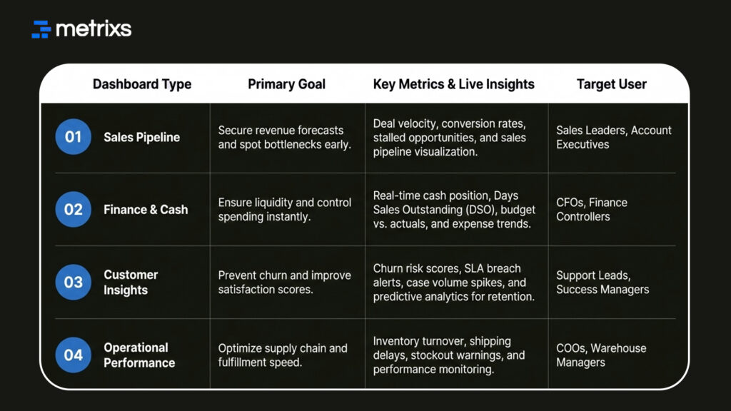
When you see a shipping delay the moment it happens, you can notify customers proactively. This transparency builds trust and keeps your logistics running smoothly.
How to Build Effective Live Dashboards in D365
Building useful tools requires a plan. You cannot just drag and drop charts and hope for the best. D365 dashboards succeed when you focus on the user’s daily needs.
Step 1: Identify Key Questions, Not Just KPIs
Dashboards must answer business questions. D365 dashboards filled with random metrics confuse users. Ask your team what they need to know to do their job.
- “Which deals are slipping?”
- “Where are we overspending?”
- “Which customers need intervention?”
A design based on actual decisions always outperforms generic dashboard automation.
Step 2: Connect D365 to Power BI Effectively
Speed defines success here. For true real-time Power BI reporting, use DirectQuery or Direct Lake mode. These connection types allow D365 dashboards to pull data instantly without waiting for a scheduled refresh. Choosing the right mode ensures your data remains fresh without slowing down the system.
Step 3: Design for Clarity and Speed
The best executive reporting tools follow the five-second rule. A user should understand the status immediately. Limit your D365 dashboards to three or five key visuals. Use clean white space and clear hierarchy. Clutter forces users to think too hard.
Step 4: Ensure Data Quality and Governance
Real-time speed magnifies bad data. Performance monitoring dashboards reveal errors the moment they happen. You must enforce strong validation rules and required fields. Reliable D365 dashboards require disciplined data entry to maintain trust.
Now that you know how to build them, you need a partner who understands the data architecture behind the visuals.
How Metrixs Helps You Build High-Impact D365 Dashboards
Metrixs delivers advanced analytics specifically for Microsoft Dynamics 365 Finance & Operations. We help enterprises consolidate data seamlessly, transforming raw ERP numbers into a unified view of D365 dashboard performance across finance, inventory, and operations.
With a comprehensive library of 1,000+ metrics and 100+ pre-built reports, Metrixs enables 80% faster real-time Power BI reporting and 99.9% data accuracy. This eliminates manual inconsistencies and siloed data, ensuring your ERP serves as a growth engine rather than just a data collector.
Key Strengths
- Rapid Integration: Get up and running in under six weeks with a seamless D365 dashboards implementation that minimizes business disruption.
- On-Demand Data Snapshots: Instantly capture historical trends, workforce shifts, and inventory flows for proactive data-driven decision-making.
- Multi-Region Flexibility: Effortlessly track multiple currencies and units of measurement to ensure consistent D365 dashboard reporting across global locations.
- Centralized Financial Oversight: Automate balance sheets and financial summaries to reduce manual work and maintain a real-time view of D365 dashboards.
- Measurable Impact: Smart insights help reduce operational costs by 15% and optimize resource allocation within your live analytics transformation strategy.
Metrixs turn data into a competitive advantage, providing the clarity and speed businesses need to scale efficiently. Explore how Metrixs ensures you use your ERP to its full advantage and simplifies D365 dashboards → Metrixs.
Conclusion
Managers who cling to spreadsheets operate in the dark. You cannot run a successful business on data that is weeks old. Markets shift too fast for you to wait on manual updates or batch processes.
Continuing with this delay destroys your agility. While you wait for a report, your competitor closes the deal you missed. Ignoring the gap between static vs live reporting leads to stalled growth and shrinking margins. You risk losing market share simply because your information arrives too late to support effective data-driven decision making.
D365 dashboards offer the clarity you are missing, and you do not need to build them from scratch. Metrixs solves this immediately with a library of 100+ pre-built reports designed specifically for Dynamics 365 Finance & Operations. We enable a complete live analytics transformation by replacing manual work with a unified, accurate view of your data.
Connect with Metrixs to simplify your reporting and unlock the full potential of your D365 dashboards.
FAQs
1. What’s the difference between static reports and live dashboards?
Static reports freeze history in Excel, leaving you with old numbers. In contrast, D365 dashboards offer a live analytics transformation, updating instantly as business happens. While static files block insight, interactive dashboard design lets you drill down and filter, ensuring you see the truth behind the metrics immediately.
2. Can Power BI dashboards update in real time inside D365?
Absolutely. By using DirectQuery or Direct Lake mode, you achieve true real-time Power BI reporting inside your ERP. This setup bypasses scheduled refreshes, so your D365 dashboards reflect changes the second a deal closes or inventory moves. It connects Dynamics 365 live dashboards directly to your operational reality.
3. How do we improve dashboard adoption?
Focus on relevance. Users ignore generic tools, so build D365 dashboards that answer daily business questions. Leveraging Power BI embedded analytics places data directly into their workflow, removing the need to switch apps. This seamless integration encourages self-service analytics, making data a natural part of their daily routine.
4. How much does it cost to build D365 live dashboards?
Costs vary based on complexity. Simple D365 dashboards often start around $3,000, while comprehensive enterprise systems with dashboard automation can range up to $50,000. Investing in professional business intelligence dashboards ensures you get a scalable architecture that supports long-term growth and complex predictive analytics needs.
5. What dashboards should executives see vs. teams?
Executives need high-level executive reporting tools to track cash flow and macro trends. Operational teams require granular D365 dashboards like sales pipeline visualization to manage daily tasks. Tailoring views ensures everyone supports data-driven decision-making without getting lost in irrelevant details or cluttered screens.
6. How do we maintain data quality for live dashboards?
Speed magnifies errors, so performance monitoring dashboards require clean input. Implement strict governance and validation rules within Dynamics to prevent bad data entry. Reliable D365 dashboards depend on this discipline. Without it, your real-time Power BI reporting will only deliver confusion instead of the clarity you need.

