
Finance and supply chain teams frequently face the Power BI vs. Tableau dilemma. It rarely comes down to a simple feature list. Market data shows Microsoft leads in broad adoption, yet Tableau remains the top choice for complex data visualization.
The right pick depends on whether you prioritize automated reporting or deep, interactive exploration. Metrixs analyzes real finance dashboard tools and supply chain analytics solutions here to help you settle the Power BI vs. Tableau debate.
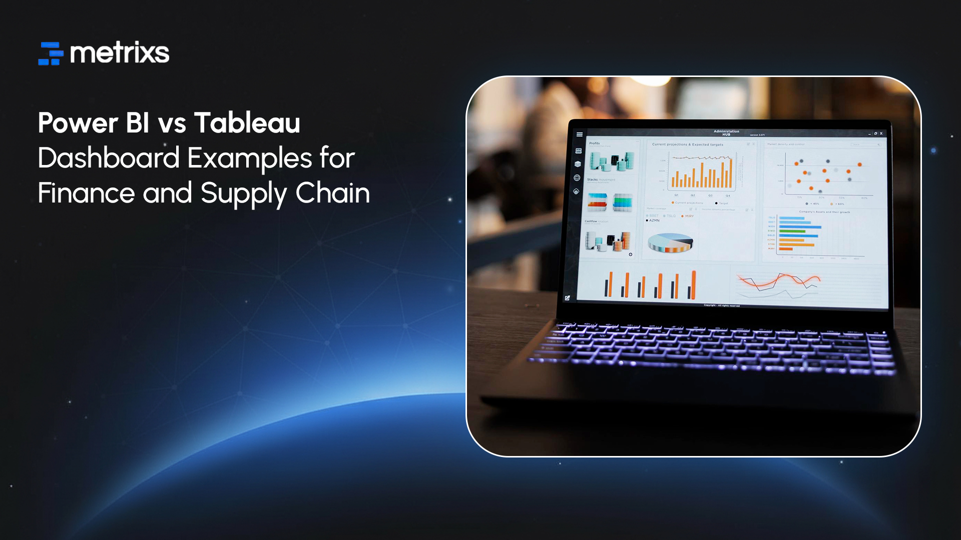
This guide provides a practical Tableau vs. Power BI comparison using actual dashboard examples to help you see which platform fits your operational needs best.
Finance Dashboards – What Power BI and Tableau Actually Deliver
You need to know what these tools output before you buy. The Power BI vs. Tableau choice in finance often splits between automating daily tasks and presenting high-level strategy. Real-world applications show distinct differences in how each platform handles financial data visualization.
1. Power BI Finance Dashboard Example: Month-End Close & Variance Analysis
Finance teams use Power BI to automate the monthly close. A typical dashboard connects directly to the ERP system. It tracks actuals versus budget in real time. You get drill-through capabilities that let you click a high-level number and see the specific invoices behind it.
- Real-world application: Automated variance bridges.
- Strengths: Strong Microsoft integration allows for complex DAX calculations and ratio metrics.
- Ideal for: Teams needing interactive reports for daily operations and frequent data refreshes.
2. Tableau Finance Dashboard Example: Executive-Grade Storytelling for Investors
CFOs often prefer Tableau for external reporting. An investor dashboard here focuses on the narrative. It visualizes portfolio performance and multi-year trends without the grid-heavy look of operational reports.
- Real-world application: KPI storytelling for board decks.
- Strengths: Superior dashboard customization creates boardroom-quality visuals.
- Ideal for: PE firms and executive presentations.
When Each Tool Wins for Finance
Pick Power BI for daily finance ops and self-service modeling. Choose Tableau for high-end visuals and analyzing large multi-year datasets.
Physical goods require different metrics, so let’s examine how these tools manage supply chain visibility.
Core Differences That Matter in Real Dashboards
Dashboards must load fast and look professional. The Power BI vs. Tableau comparison often hinges on how the software handles data under the hood. Technical constraints limit what your team can build effectively.
1. Data Volume & Performance
Power BI works best with moderate, structured datasets. Tableau excels with massive or messy data. Its superior data handling performance makes it the preferred choice for heavy supply chain analytics solutions that process millions of rows instantly without slowing down.
2. Visualization & Customization Depth
Power BI prioritizes speed. You get clean interactive reports quickly using standard charts. Tableau prioritizes freedom. It offers deep dashboard customization for pixel-perfect designs. Distinct data visualization features in Tableau allow for more creative storytelling than most Tableau alternatives.
3. Integration Strength
Microsoft integration defines Power BI. It connects seamlessly with Excel, Azure, and Teams. Tableau works as a platform-agnostic tool. It connects easily to Salesforce and Google Cloud. This makes it a flexible finance dashboard tool for mixed-tech environments.
4. Predictive & Advanced Analytics
The Power BI vs. Tableau choice also changes how you handle AI. Power BI features like Q&A and anomaly detection help business users find answers fast. Tableau targets data scientists. It supports deep predictive analytics through direct integration with R and Python.
A Comparison Table of Technical Specs & Practical Fit:

Performance matters, but the power bi vs tableau decision usually comes down to budget. Let’s break down the costs and learning curves next.
Cost, Learning Curve & Practical Considerations
Budget and timeline often dictate the final tool choice. The Power BI vs. Tableau comparison shifts dramatically when you look at total ownership costs and training time.
1. Licensing & Total Cost of Ownership
Power BI offers a low barrier to entry. Pro licenses start around $10 per user/month. Tableau charges creators significantly more, often $70+. However, for large-scale external reporting, Tableau can sometimes offer lower long-term server costs.
This nuance makes it a competitive option among finance dashboard tools despite the higher initial price tag. Detailed cost comparisons of BI tools reveal that Power BI costs rise as your data storage needs grow.
2. Team Skill Requirements
Power BI leverages your team’s Excel skills. Users adopt it quickly. Tableau requires a steeper learning curve. It demands a new way of thinking about data. While harder to learn, it offers a higher ceiling for analytics than most Tableau alternatives.
3. Implementation Timelines
Most teams launch Power BI dashboards in 4–8 weeks. Tableau often requires 8–16 weeks for enterprise-grade deployment.
Money isn’t the only factor; you need a clear framework to make the final call.
How to Choose: A Simple Decision Framework
You need a practical method to settle the Power BI vs. Tableau debate. Your specific business goals dictate the winner. A clear Tableau vs Power BI comparison highlights distinct paths for different needs.
A) Choose Power BI. If Your Priorities Are:
- Real-time operational finance: You need real-time analytics platforms that update instantly.
- Inventory dashboards: You want standard inventory management dashboards connected to Dynamics 365.
- Cost efficiency: You need to deploy reporting to hundreds of users cheaply.
- Microsoft Stack: You rely heavily on Microsoft integration and Excel.
B) Choose Tableau If Your Priorities Are:
- Complex logistics: You require supply chain analytics solutions that map global routes.
- Visual Storytelling: You present to investors who demand polished visuals.
- Data Volume: You analyze massive multi-source datasets that slow down other business intelligence tools.
- Advanced analytics: You need deep predictive analytics and custom statistical modeling.
Reviewing the Power BI vs. Tableau features clarifies the decision, but implementation is the next hurdle. Here is how expert help ensures success.
How Metrixs Helps Teams Decide & Implement

Metrixs delivers advanced analytics and reporting insights specifically for Microsoft Dynamics 365 Finance & Operations. We help enterprises consolidate data seamlessly, transforming raw ERP numbers into a unified view of finance dashboard tools’ performance across finance, inventory, and operations.
With a comprehensive library of 1,000+ metrics and 100+ pre-built reports, Metrixs enables 80% faster supply chain analytics solutions reporting and 99.9% data accuracy. We eliminate manual inconsistencies and siloed data, ensuring your ERP serves as a growth engine rather than just a data collector.
Our Key Strengths:
- Rapid Integration: Get up and running in under six weeks with a seamless Power BI vs. Tableau implementation that minimizes business disruption.
- On-Demand Data Snapshots: Instantly capture historical trends, workforce shifts, and inventory flows for proactive supply chain analytics solutions decision-making.
- Multi-Region Flexibility: Effortlessly track multiple currencies and units of measurement to ensure consistent finance dashboard tools reporting across global locations.
- Centralized Financial Oversight: Automate balance sheets and financial summaries to reduce manual work and maintain a real-time view of Power BI vs. Tableau metrics.
- Measurable Impact: Smart insights help reduce operational costs by 15% and optimize resource allocation within your supply chain analytics solutions strategy.
Metrixs turn data into a competitive advantage, providing the clarity and speed businesses need to scale efficiently. Explore how Metrixs ensures you use your ERP to its full advantage and simplifies Power BI vs. Tableau. Metrixs
Conclusion
Picking the wrong winner in the Power BI vs. Tableau debate creates chaos. Teams get stuck fixing broken reports instead of analyzing profits. Bad choices lead to wasted budgets and finance dashboard tools that gather dust.
You risk flying blind while competitors optimize their networks with superior data, leaving your strategy exposed to avoidable risks.
Metrixs eliminates this uncertainty. We analyze your specific infrastructure to implement the correct supply chain analytics solutions for your goals. We help you test both platforms with real data so you invest with confidence.
Ready to see which tool actually fits your data? Start your dashboard pilot with Metrixs today.
FAQs
1. Can Power BI handle large datasets?
Yes, but optimization is key. While it processes moderate data well, massive datasets often require Power BI features like Incremental Refresh. For raw, unmodeled data at scale, Tableau often outperforms most Tableau alternatives in pure data handling performance without needing extensive backend prep.
2. Which is better for consolidation reporting?
Power BI dominates here. Its modeling excels at managing complex parent-child hierarchies, making it the superior finance dashboard tool for rolling up multi-entity financials. It automates reconciliations better than most business intelligence tools, streamlining your month-end close process significantly.
3. Do both integrate with major ERPs?
Yes, both connect to SAP and Oracle. However, Power BI offers seamless native Microsoft integration for Dynamics 365, ensuring faster deployment. Tableau connects via standard APIs, making it a flexible choice for diverse supply chain analytics solutions that pull data from non-Microsoft environments.
4. Cost differences over 5 years?
Power BI usually wins on price. Its low monthly user fees make it ideal for broad internal rollout. Detailed cost comparisons of BI tools show Tableau’s higher creator fees raise the Total Cost of Ownership (TCO), though it remains valuable for specialized financial data visualization needs.
5. Predictive analytics comparison?
Tableau leads for data scientists, offering deep integration with R and Python. However, Power BI features like AI-driven “Key Influencers” and Copilot now bring powerful predictive analytics to everyday business users, making advanced insights accessible without coding skills.
6. How to choose if the team is inexperienced?
Start with Power BI. Its interface mimics Excel, making it the most accessible among Tableau alternatives. Teams familiar with PivotTables can build interactive reports quickly, whereas Tableau’s unique “canvas” approach requires a steeper learning curve to master its advanced dashboard customization.

